Design systems - preview
Introduction
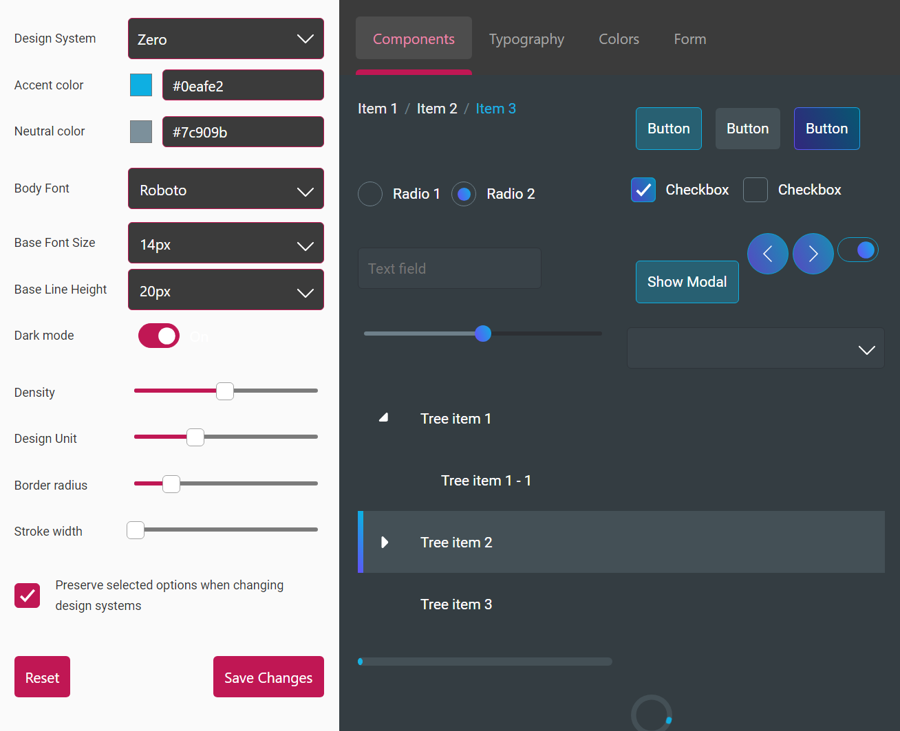
The Design System Configurator can be used to customise and tailor the design system according to your specific needs.
On the left-hand side, is the Editor, where you can make all the modifications you want. On the right side, you can see the Preview with the results of those changes.
Try changing the configurations and observe the reflected changes on the right.
Editor
The Preserve selected options... checkbox in the editor is ticked by default.
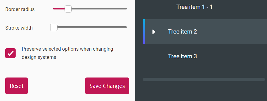
This means that when you switch between design systems, all of your selections are retained. For instance, if you change the Accent Color while on the Zero design system, and then switch to Foundation-UI, you will see the changes you made there as well.
Alternatively, if it's unticked, switching between design systems will not retain the configurations. Instead, they will be reset to design system defaults.
Note that in the documentation, the DSC (Design System Configurator), is in preview mode rather than application mode. There are minor but significant differences between them.
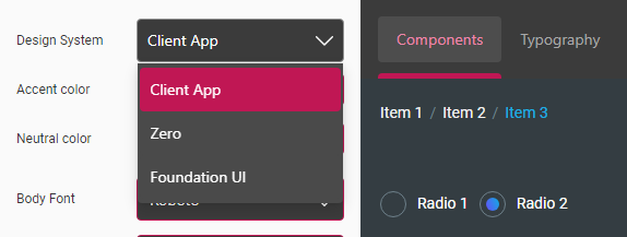
The Design System is an important configuration. Depending on which one you choose, you will get a different look. While in preview mode, you will see Zero and Foundation UI in the dropdown list of Design System. But in application mode, you will see one more design system.
For example, if you have launched DSC from an application called client-app, you will also see Client App in the dropdown list.
| Preview dropdown | Application dropdown |
 |  |
In the editor, after you have configured the design system, there are two more things you can do:
Saving tokens
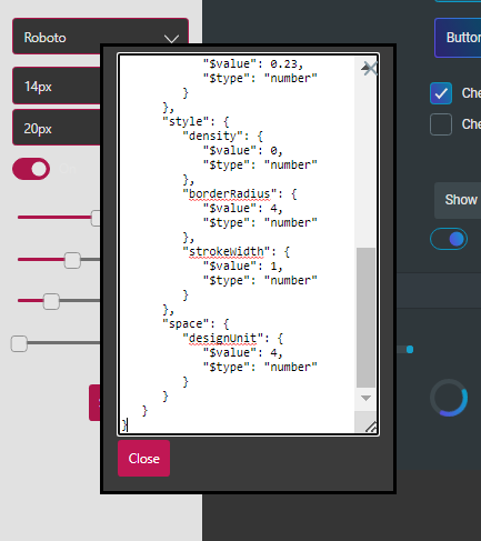
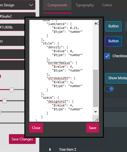
Once you're happy with all the changes, you can click the Save button. At this point, a modal is prompted that shows you the configured design tokens in a JSON format.
Because this is only a preview, only the Close button is shown on the modal. When the DSC app is launched, you will see another Save button parallel to the Close one. Clicking the Save button, saves all the changes; this is reflected in the application you're currently running the Design System Configurator from.
See the images below.
| Preview Modal | Application Modal |
 |  |
Resetting tokens
Alternatively, if you no longer need the modifications you have made, click the Reset, which reverts the values back to their default state.
Preview
In the preview, you can see four tabs displaying the information suggested by their titles.
Components
The contents of the Components tab reflect the components that are affected by the configurations of the design tokens.
The components we see here are only a small collection used for the purpose of displaying an example. There are many more components that you have access to.
Typography
The Typography tab displays the list of typography tokens avilable for you to use. Click on the tab in the preview and observe the changes to the Body Font, Base Font Size and Base Line Height as you configure these tokens on the left-hand side.
Colors
The Colors tab, as you may suspect, shows the design tokens available for setting colour. Click on the Colors tab and observe the reflected changes as you configure the Accent color and Neutral color design tokens.
Form
The Form tab displays a Smart Form. This is another component available for us to use. It utilizes a collection of other components like text-field, combobox and checkbox. Design tokens like Density and Design Unit will trigger more visible changes in the preview. Go to the Form tab and configure the design tokens in the editor to see the results.
