Foundation Forms - controls
Foundation forms has a range of advanced components for entering text, numbers, floats, dates and booleans, as well as select and autocomplete input boxes. You can use these to create polished, complex forms for your application in quick time.
Text control

This is the standard renderer. This creates a text-field in your form. The input takes any characters.
// text Input
const textInputJsonSchema: JSONSchema7 = {
  type: 'string',
  description: 'kotlin.String',
}

const textInputUiSchema: UiSchemaElement =     {
  type: 'Control',
  scope: '#/properties/textInput',
};
Number control

The number renderer creates a number-field in your form. This input only accepts numeric data. It sets a numeric value on the underlying form model.
// number Input
const numberJsonSchema: JSONSchema7 = {
  type: 'number',
  description: 'kotlin.Double'
};

const numberInputUiSchema: UiSchemaElement = {
  type: 'Control',
  scope: '#/properties/numberInput'
};
Boolean control
The boolean renderer creates a checkbox control. Set the type value in the JSONSchema to boolean to invoke this renderer. It sets a true or false on the underlying form model.
// Boolean Input
const booleanInputJsonSchema: JSONSchema7 = {
  type: 'boolean',
  description: 'kotlin.Boolean'
};

const booleanInputUiSchema: UiSchemaElement = {
  type: 'Control',
  scope: '#/properties/booleanInput'
};
Date control

The date control schema creates a date renderer with an input field and a date picker. To invoke this control, set the description property in the JSONSchema to org.joda.time.DateTime. The form only allows numbers to be input. it stores the date value in miliseconds in the underlying form model.
// Date time Input
const dateInputJsonSchema: JSONSchema7 = {
  type: 'number',
  description: 'org.joda.time.DateTime',
};

const dateInputUiSchema: UiSchemaElement = {
  type: 'Control',
  scope: '#/properties/dateInput'
};
Password control
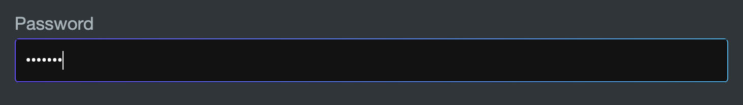
The password control schema creates a password field. This is a text field with the input characters obscured. To invoke this renderer, set the isPassword property in options to be true in the JSONSchema.
// Password Input
const passwordInputJsonSchema: JSONSchema7 = {
  type: 'string',
  description: 'kotlin.String'
};

const passwordInputUiSchema: UiSchemaElement = {
  type: 'Control',
  scope: '#/properties/password',
  options: <StringRendererOptions>{
    isPassword: true,
  }
};
Textarea control
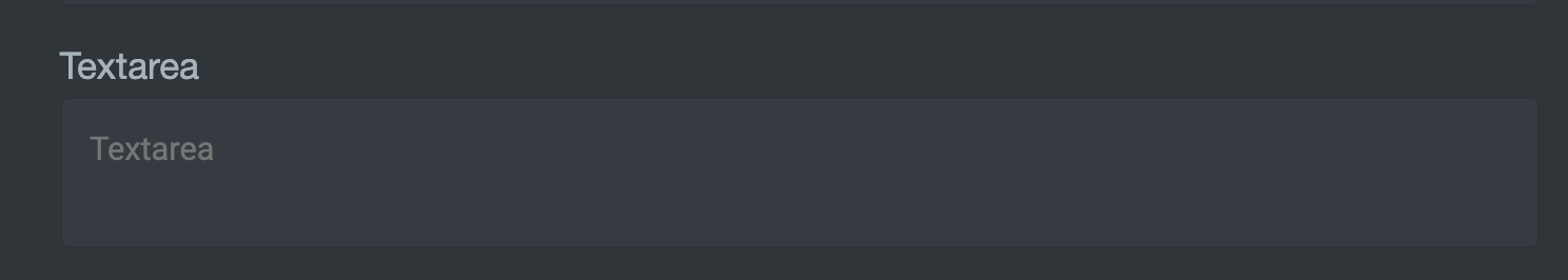
The textarea control schema creates a textarea field. This a multi-line entry field. To invoke this renderer, set the textarea property in options to be true in the JSONSchema.
// Textarea Input
const textAreaInputJsonSchema: JSONSchema7 = {
  type: 'string',
  description: 'kotlin.String'
}

const textAreaInputUiSchema: UiSchemaElement = {
  type: 'Control',
  scope: '#/properties/textarea',
  options: <StringRendererOptions>{
    textarea: true,
  }
}
Select control

The select control schema creates a dropdown select box. Users can select only one value from the given list.
Tp invoke this renderer, include an options section in the UISchemaElement with an array of data. You can specify which properties of your array objects are used for the underlying option value, valueField, and for the display value, labelField.
// Select Input
const selectData = ['Miami', 'New York', 'London', 'Dublin', 'São Paulo', 'Bengaluru']

const selectInputJsonSchema: JSONSchema7 = {
  type: 'string',
  description: 'kotlin.String',
  enum: selectData
}

const selectInputUiSchema: UiSchemaElement = {
  type: 'Control',
  scope: '#/properties/selectInput',
  options: <ConnectedRenderersOptions> {
    data: selectData.map(label => ({ label })),
    labelField: 'label',
    valueField: 'label'
  }
}
Connected select

The connected select renderer creates a select input field that populates the list of dropdown options from an endpoint in your Data Server.
In the UISchemaElement options property, specify the allOptionsResourceName. In this example, we use the ALL_COUNTERPARTIES endpoint from sales-forms-examples.dataserver.kts to use the list of counterparties. The display value is the counterparty name and the underlying value is the counterparty id.
// Connected multi select
const connectedSelectJsonSchema: JSONSchema7 = {
  type: 'string',
  description: 'Kotlin.String',
}

const connectedSelectUISchema: UiSchemaElement = {
  type: 'Control',
  label: 'Connected select',
  scope: '#/properties/connectedSelectInput',
  options: {
    allOptionsResourceName: 'ALL_COUNTERPARTIES',
    valueField: 'COUNTERPARTY_ID',
    labelField: 'NAME',
  }
}
Connected multi select
The connected multi select renderer connects to your back end in the same way the connected select renderer.
To invoke the connected multi select renderer, in the JSONSchema, specify the type property to be array.
// Connected multi select
const connectedMultiSelectJsonSchema: JSONSchema7 = {
  type: 'array',
  description: 'Kotlin.String',
}

const connectedMultiSelectUISchema: UiSchemaElement = {
  type: 'Control',
  label: 'Connected select',
  scope: '#/properties/connectedMultiSelectInput',
  options: {
    allOptionsResourceName: 'ALL_COUNTERPARTIES',
    valueField: 'COUNTERPARTY_ID',
    labelField: 'NAME',
  }
}
Full UI and JSON schema
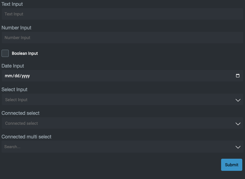
Using all the examples above, here is a foundation-form that uses the all the input controls we have listed. Try it yourself!
// Form Schema
export const formControlsJSONSchema: JSONSchema7 = {
  type: 'object',
  properties: {
    textInput: textInputJsonSchema,
    numberInput: numberJsonSchema,
    booleanInput: booleanInputJsonSchema,
    dateInput: dateInputJsonSchema,
    selectInput: selectInputJsonSchema,
    connectedSelectInput: connectedSelectJsonSchema,
    connectedMultiSelectInput: connectedMultiSelectJsonSchema,
  }
};

export const formControlsUISchema: UiSchema = {
  type: 'VerticalLayout',
  elements: [
    textInputUiSchema,
    numberInputUiSchema,
    booleanInputUiSchema,
    dateInputUiSchema,
    selectInputUiSchema,
    connectedSelectUISchema,
    connectedMultiSelectUISchema,
  ]
}
<foundation-form
  :jsonSchema="${() => formControlsJSONSchema}"
  :uischema="${() => formControlsUISchema}">
</foundation-form>
Full source code at Controls
License
Note: this project provides front-end dependencies and uses licensed components listed in the next section; thus, licenses for those components are required during development. Contact Genesis Global for more details.
Licensed components
Genesis low-code platform