Foundation Forms layouts
Foundation forms allows you to customise the layout of your forms.
The layouts must be one of UiSchemaElementType which are:
VerticalLayout- arranges the form elements vertically.HorizontalLayout- arranges the form elements horizontally.LayoutVertical2Columns- arranges the form elements in two columns vertically.Group- creates a form divided into separate groups, each with its own label.Categorization- creates a form divided into tabs, with only one tab (section) visible at a time.Array- creates a dynamic form for entering multiple instances of a data type.Stepper- creates a tabbed form with a sidebar showing form progress. Each step is completed separately by the user.
The layout of a form is configured in the type property of the UISchema
By default, the form uses VerticalLayout if no uiSchema is specified.
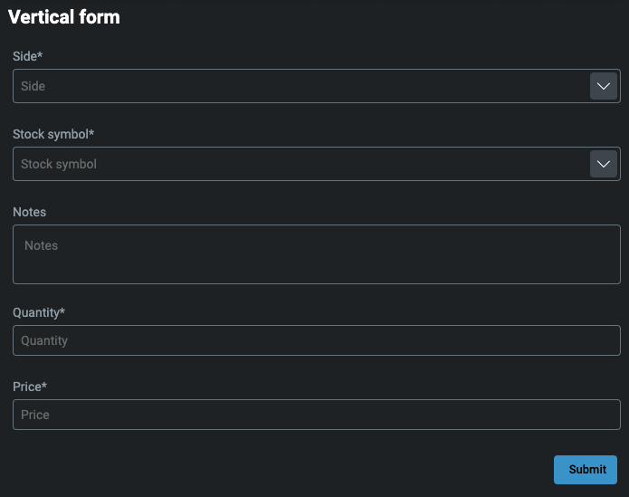
Vertical layout
Each item in the elements property is arranged vertically.
const uISchema: UISchema = {
  type: 'VerticalLayout',
  elements: [
    ...
  ]
}
Horizontal layout
Each item in the elements property is arranged horizontally.
const uISchema: UISchema = {
  type: 'HorizontalLayout',
  elements: [
    ...
  ]
}

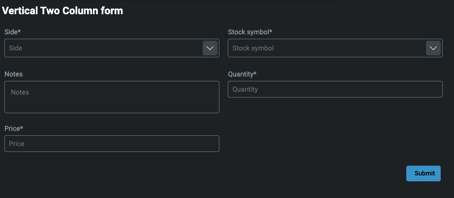
Vertical two-column layout
Each item in the elements property is arranged vertically, with two items per line.
const uISchema: UiSchema = {
  type: 'LayoutVertical2Columns',
  elements: [
    ...
  ]
}
Group
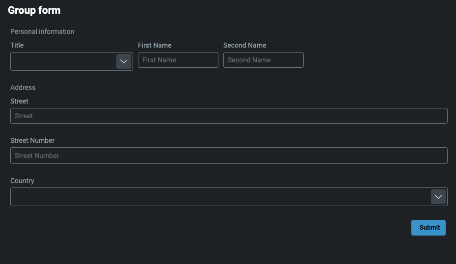
This is used for grouping form elements into separate blocks. Each section (block) has its own label.
In the example below, we have personal information split into basic and address sections. You can add as many groups as you want.
const uISchema: UiSchema = {
  type: 'VerticalLayout',
  elements: [
    {
      type: 'Group',
      scope: '#/properties/basic',
      label: 'Personal information',
      options: {
        childElements: [
          ...
        ]
      }
    },
    {
      type: 'Group',
      label: 'Address',
      scope: '#/properties/address',
      options: {
        childElements: [
          ...
        ]
      }
    }
}
Categorization
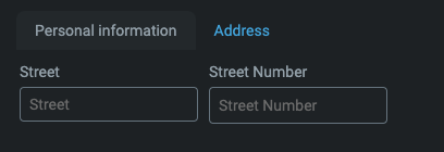
This is used for grouping form elements into separate blocks. Each section (block) is shown in its own tab, and only one tab is visible at a time.
const uISchema = {
  type: 'Categorization',
  elements: [
    {
      type: "Control",
      scope: "#/properties/basic",
      label: "Personal information",
      options: {
        childElements: [
          {
            type: "HorizontalLayout",
            elements: [
              ...
            ]
          }
        ]
      }
    },
    {
      type: "Control",
      label: "Address",
      scope: "#/properties/address",
      options: {
        childElements: [
          {
            type: "HorizontalLayout",
            elements: [
              ...
            ],
          },
        ],
      },
    },
    }

Array
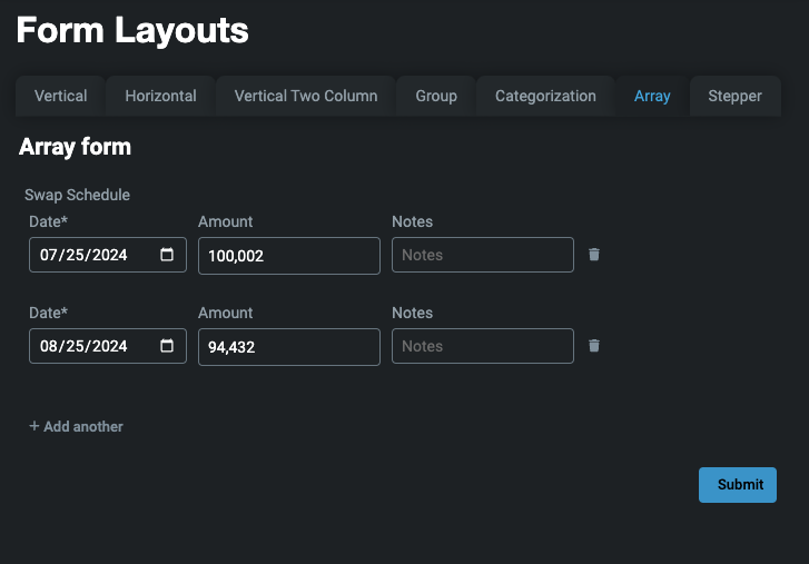
An array layout enables you to create a dynamic form with the ability to add multiple instances of your jsonSchema model. For this, you need both a uiSchema and a jsonSchema.
In this example, we are creating a form where the user can input multiple Swap Schedule items. Another case would be adding multiple users at once.
export const formsWithArraysJsonSchema: JSONSchema7 = {
  properties: {
    swapDates: {
      type: 'array',
      title: 'Swap Schedule',
      items: {
        type: 'object',
        properties: {
          date: {
            type: 'number',
            description: 'org.joda.time.DateTime',
          },
          amount: {
            type: 'number'
          },
          notes: {
            type: 'string'
          }
        },
        required: [ 'date', 'number' ]
      }
    }
  }
}

export const formsWithArraysUiSchema: UiSchema = {
  type: 'VerticalLayout',
  elements: [
    {
      type: 'Control',
      scope: '#/properties/swapDates'
    }
  ]
}
Stepper
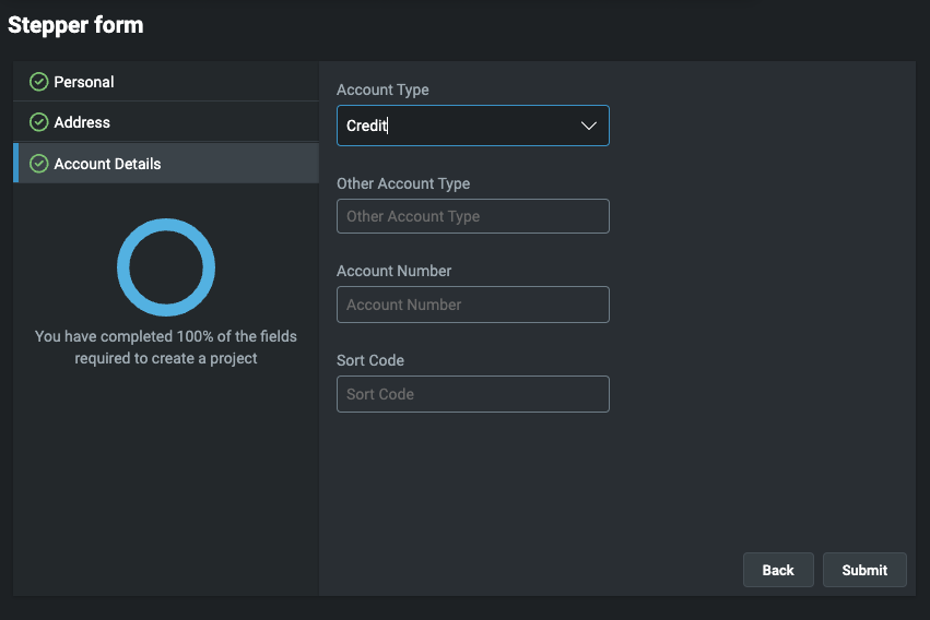
Stepper layout enables you to create more complex forms that can be divided into appropriate groups. Each group is a step that the user will have to complete. This is a useful way of leading a user through complex processes.
Customisation is more complicated, because it needs a proper jsonSchema and uiSchema so that validation and data saving work properly.
In this example, we have a form with three steps - personal, address and account details. Each step must be valid according to the underlying json schema before the user can continue to the next section.
Remember to add a hide-submit-button attribute to foundation-forms, because in this case, submit is built directly into stepper-layout.
<foundation-form
    hide-submit-button="true"
    ...
>
</foundation-form>
const uiSchemaStepper = {
  type: 'Stepper',
  elements: [
    {
      type: 'Control',
      scope: '#/properties/person',
      label: 'Personal',
      options: {
        childElements: [
          {
            type: 'HorizontalLayout',
            elements: [
              ...
            ],
          },
          {
            type: 'HorizontalLayout',
            elements: [
              ...
            ],
          },
        ],
      },
    },
    {
      type: 'Control',
      label: 'Address',
      scope: '#/properties/address',
      options: {
        childElements: [
          {
            type: 'HorizontalLayout',
            elements: [
              ...
            ],
          },
          {
            type: 'HorizontalLayout',
            elements: [
              ...
            ],
          },
        ],
      },
    },
    {
      type: 'Control',
      label: 'Account details',
      scope: '#/properties/accountDetails',
      options: {
        childElements: [
          {
            type: 'VerticalLayout',
            elements: [
              ...
            ],
          },
        ],
      },
    },
  ],
};
This creates a three-step form with each step validated individually.
Full source code at Layouts
License
Note: this project provides front-end dependencies and uses licensed components listed in the next section; thus, licenses for those components are required during development. Contact Genesis Global for more details.
Licensed components
Genesis low-code platform