React - getting started
It is easy to set up a new project where your front end uses the React framework.
On this page, we shall show you how to set up an empty project that you can use as a blank canvas for adding React and Genesis components.
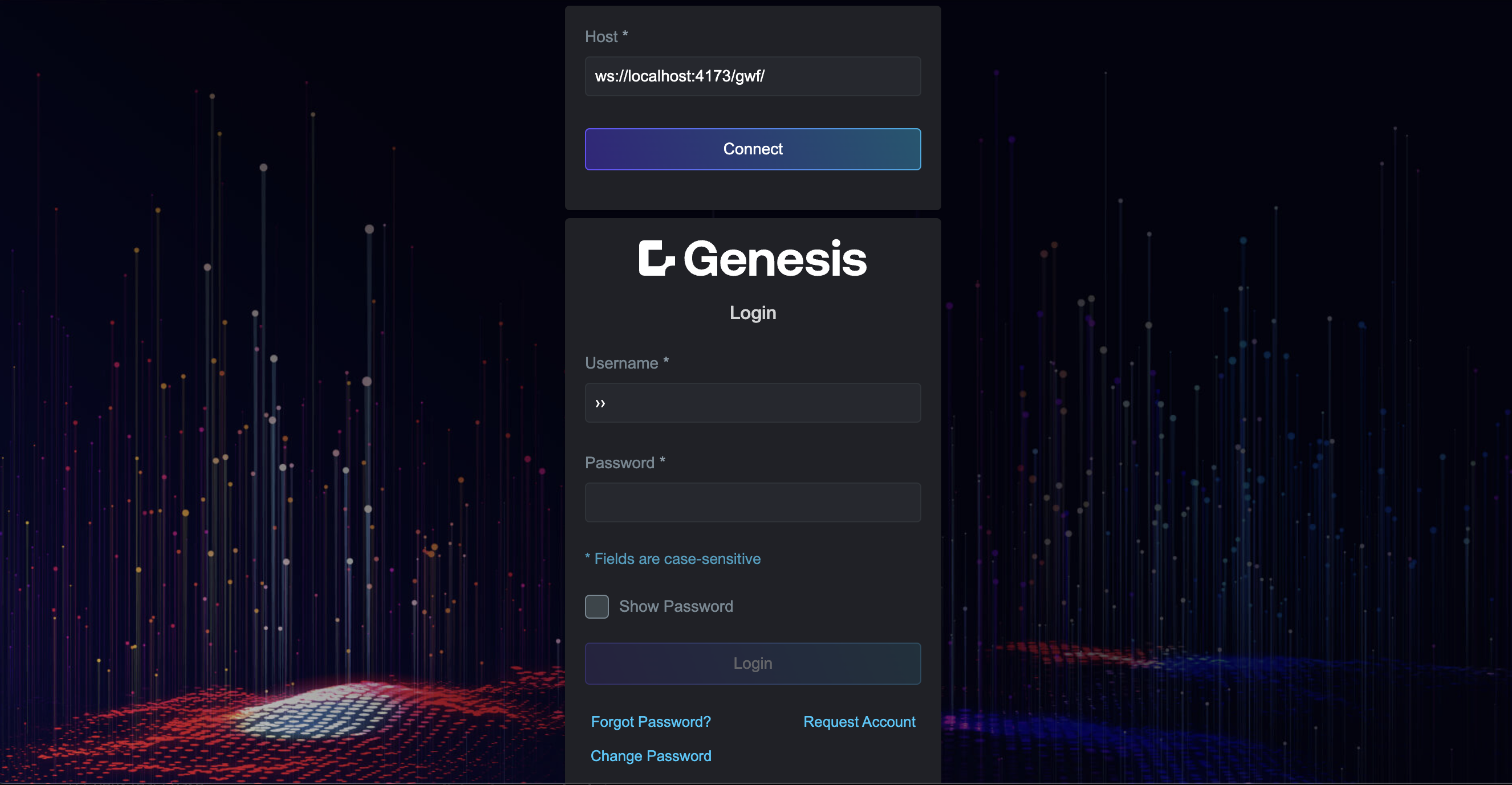
These simple steps create an app you log run and log into, and an empty home page. You are then ready to go into the code and add some components.
We shall also look briefly at:
- the folder structure of the project
- the principles of routing and styling an application
You can find out more by looking into our example application, where you can look at the code and check the results against the running application.
Setting up the React project
- reate a new React project. The example below creates a project called myApp using Genx with
--framework React:
npx -y @genesislcap/genx@latest init myApp -s blank-app-seed --framework React -x
- Navigate to your new project's client directory:
cd ./client
Install the dependencies and start the app
- Run the following command from your project folder:
npm run bootstrap
- Start the app in development mode:
npm run dev
The development server launches your project and makes it available on localhost:

The project is currently based on React 19, which is in the Release Candidate (RC) stage. This version provides improved support for integration with Web Components, making it easier to share data and manage state between React components and Web Components.
Project folder structure and main elements
src/main.tsx
This is the main entry point for the application. It bootstraps the app by rendering the App.tsx component into the DOM. The file also registers PBCs using registerPBCs.
src/pbc
This folder contains components that are responsible for enabling the insertion of slots within the application. These slots act as placeholders where content, provided by the registered Project Building Components (PBCs), is dynamically rendered. The PBCs are registered in the application through main.tsx, ensuring that specific components can be inserted into the designated slots at runtime.
src/share
The share folder holds shared resources and components that are used across the entire application. It includes components like genesis-components.ts, which registers Genesis framework components, and foundation-login.ts, which sets up the login function for the app.
Key files are:
- genesis-components.ts. This registers Genesis framework components, including forms, layouts, and charts.
- foundation-login.ts. This configures the foundation-login micro front-end component that handles authorisation and integrates it with the routing system.
src/pages
This folder contains the main pages of the application. Each page represents a different route or view, such as the AuthPage, which handles authentication-related flows.
src/components
This folder contains UI components that are used throughout the app. Components in this folder are not tied to specific pages, but are used as building blocks across multiple sections of the application.
Routing
In React, routing is essential for creating single-page applications with navigation capabilities.
The routing configuration in store/RoutesContext.tsx manages and provides routes throughout the application. This file defines a RoutesProvider component that combines routes from the main application and additional routes from PBC (Pluggable Business Components).
The pbcRoutes are generated dynamically by mapping over the routes provided by the PBC, extracting essential properties, and wrapping them in a PBCContainer component. These routes are then combined with the main application's routes into a single allRoutes array.
The RoutesProvider uses the React Context API to make these routes available to the rest of the application by wrapping its children with the RoutesContext.Provider.
Additionally, the useRoutesContext hook is provided to access the routes context within functional components. This ensures seamless integration and accessibility of both main application routes and PBC routes throughout the application.
Styling the application
Global styles
You can add global styles by modifying the main stylesheet located at src/styles/styles.css. This file contains styles that apply to the entire application.
Styling specific components or pages
For more granular control, you can add styles to a specific page or component.
For example, if you want to have styling for the page that is displayed when a requested page cannot be found, create a stylesheet called src/pages/NotFoundPage/NotFoundPage.css with styles that only apply to that page.
Design tokens
Design tokens are declared in the src/styles/design-tokens.json file. They offer an effective way to manage and apply styles in your application in a consistent and maintainable manner.
The design tokens enable you to define and manage values such as colours, fonts, and spacing across the whole application. You can modify these tokens to propagate changes wherever they are used in the application.
See more details in our page on Design systems