Web Components - Dropdown menu
Dropdownmenu extends foundationElement.
The items in a dropdown menu are only displayed when a user clicks to view them; the user can then choose one of the pre-defined items or click outside the menu to remove the items from the display.
Set-up
import { foundationDropdownMenu } from "@genesislcap/foundation-ui";
import { getExports } from "../utils";
const { defaultConfig, shadowOptions, styles, template } = getExports(
  foundationDropdownMenu
);

provideDesignSystem().register(zeroDropdowMmenu());
Attributes
When you declare an <alpha-dropdown-menu>, you can define the following attributes:
| Name | Type | Description |
|---|---|---|
| autoclose | boolean | Sets the component to close when the user clicks on an item. Default: true |
| open | boolean | Sets the component to start opened. Default: false |
| name | string | Sets a name for the component. Default:Dropdown Menu |
| buttonAppearance | string | Changes the initial button for the dropdown. This can be neutral, accent, lightweight, outline or stealth |
Defining the menu items
When you use <alpha-drodown-menu>, you need to use the following method to define the items in the menu:
| Name | Type | Description |
|---|---|---|
| items | DropdownMenuItem[] | Creates a list of items to be displayed in the dropdown-menu |
To define the menu items, you need to create an array of objects following the structure below:
{
  name: string;
  icon?: {
    variant?: IconStyle;
    name: string;
    size?: FaSize;
  };
  color?: string;
  submenu?: DropdownMenuItem[];
  callback?: (params?: any) => void | any;
  isDisabled?: (params?: any) => boolean;
}
Below you see the description of each field:
| Name | Type | Description |
|---|---|---|
| name | string | The name that appears in each menu item |
| icon: variant | string | The type of the icon. E.g.: Solig, Brands, ... |
| icon: name | string | The name of the icon. E.g.: facebook  , youtube , youtube  , microphone , microphone  , ... , ... |
| icon: size | string | The size of the icon according to Fa-size. E.g.: xs, sm, xl, ... |
| color | string | The colour of the item to be displayed |
| submenu | DropdownMenuItem[] | A new block of code with all the attributes listed here, which sets up the new submenu items |
| callback | function() | Define a callback function to trigger an action |
| isDisabled | boolean | Define whether this particular item is enabled or disabled |
Usage
Here is an example of how to set up a zero-dropdown-menu with some subitems attached:
- Create the structure of the dropdown menu
import {... , ref} import '@genesislcap/web-core';
...
    <zero-dropdown-menu ${ref('localDropdown')}></zero-dropdown-menu>
...
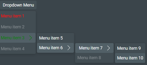
- Write the codeblock that creates the subitems. In this example, menu item 3 has a submenu, which itself has two further submenus.
const DropdownMenuItems = [
  {
    name: 'Menu item 1',
    color: "red",
    callback: () => console.log(`Menu item 1`),

  },
  {
    name: 'Menu item 2',
    callback: () => console.log(`Menu item 2`),
    isDisabled: () => true,
  },
  {
    name: 'Menu item 3',
    color: "green",
    callback: () => console.log(`Menu item 3`),
    submenu: [
      {
      name: 'Menu item 5',
      callback: () => console.log(`Menu item 5`),
      },
      {
        name: 'Menu item 6',
        callback: () => console.log(`Menu item 6`),
        submenu: [
          {
          name: 'Menu item 7',
          callback: () => console.log(`Menu item 7`),
          submenu: [
            {
            name: 'Menu item 9',
            callback: () => console.log(`Menu item 9`),
            },
            {
              name: 'Menu item 10',
              callback: () => console.log(`Menu item 10`),
            },
          ]
          },
          {
            name: 'Menu item 8',
            callback: () => console.log(`Menu item 8`),
            isDisabled: () => true,
          },
        ]
      },
    ]
  },
  {
    name: 'Menu item 4',
    callback: () => console.log(`Menu item 4`),
    isDisabled: () => true,
  },
];
- Assign the variable
DropdownMenuItemsto the fielditems:
import {DropdownMenu} from '@genesislcap/foundation-zero';
...
    localDropdown: DropdownMenu
    localDropdown.items = DropdownMenuItems
...
With these three samples of code, you would get a dropdownmenu as shown below: