Angular - Position app
This simple tutorial guides you through creating a responsive Angular application with a layout that uses the grid-layout component.
- Set up the project
- Create a layout with tiles
- Specify the source of data for the grid
- Add insert, modify and delete events
- Add a schema to customise the layout
- Add and configure a chart
- Handle when the user selects a row
1. Set up the project
To set up your project, run the following commands:
git clone https://github.com/genesiscommunitysuccess/integration-examples.git
cd integration-examples/angular/position-app-starter
npm install
npm start
2. Create a grid layout with tiles
Add this code to your home.component.html file to set up four different tiles:
<zero-grid-layout row-count="2" col-count="2" class="content-around spacing-4x" >
  <!-- Tile 1: Positions -->
  <zero-grid-layout-item col-number="1" row-number="1" width="1" height="1" style="background-color: grey">
    <!-- Content for Positions -->
  </zero-grid-layout-item>

  <!-- Tile 2: Entity Management - Trades -->
  <zero-grid-layout-item col-number="2" row-number="1" width="1" height="1" style="background-color: darkgrey">
    <!-- Entity Manager for ALL_TRADES -->
  </zero-grid-layout-item>

  <!-- Tile 3: Donut Chart -->
  <zero-grid-layout-item col-number="1" row-number="2" width="1" height="1" style="background-color: lightgrey">
    <!-- Donut Chart -->
  </zero-grid-layout-item>

  <!-- Tile 4: Line Chart -->
  <zero-grid-layout-item col-number="2" row-number="2" width="1" height="1">
    <!-- Line Chart -->
  </zero-grid-layout-item>
</zero-grid-layout>
In your browser you can see the four tiles displayed, each with different background colour. These are placeholders for our content:
3. Specify the source of data for the grid
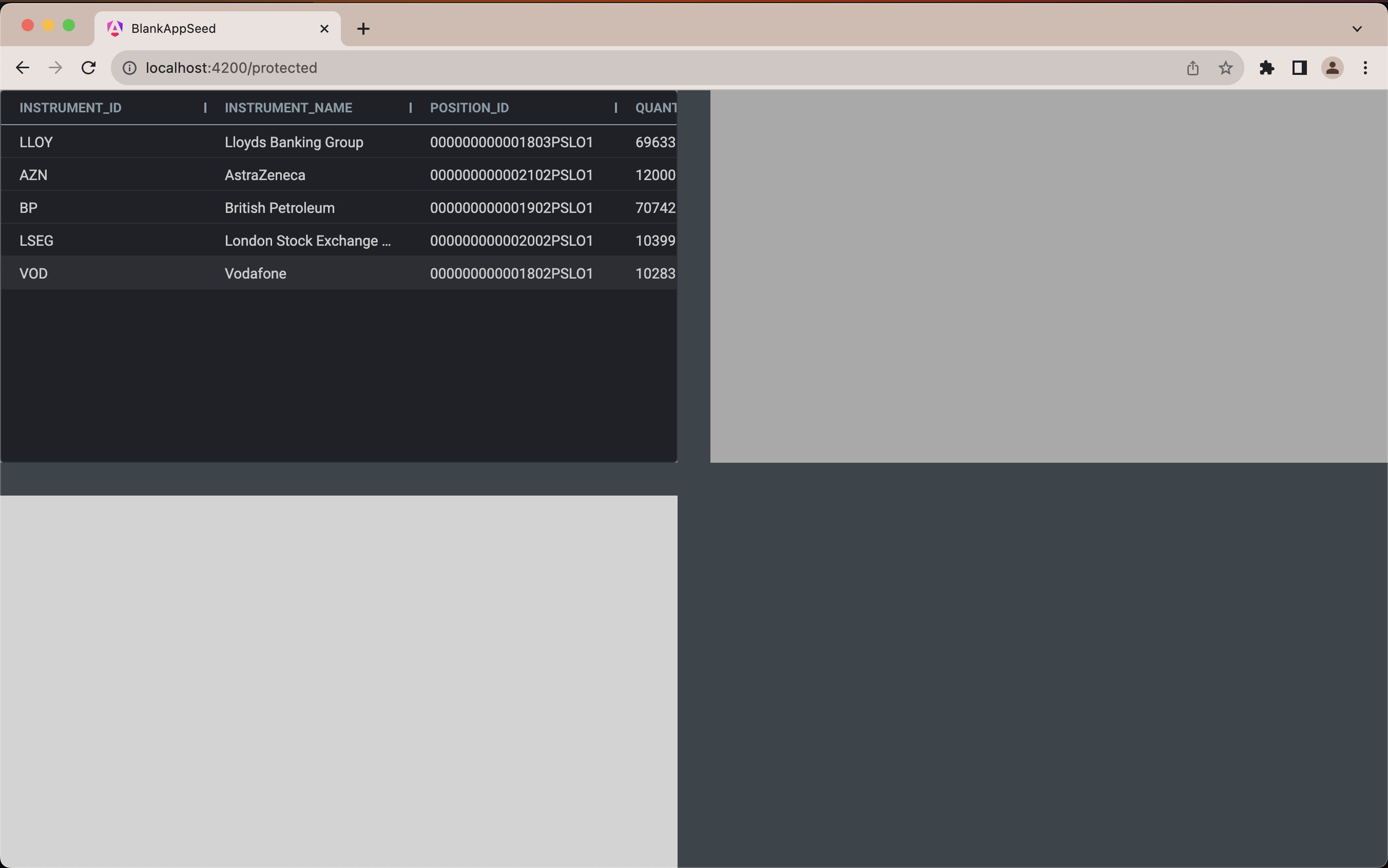
<!-- Content for Positions -->
  <zero-grid-pro>
    <grid-pro-genesis-datasource
      resource-name="ALL_POSITIONS"
    ></grid-pro-genesis-datasource>
  </zero-grid-pro>
The browser should reload automatically, showing the grid with data in it.
4. Add insert, modify and delete events
<!-- Entity Manager for ALL_TRADES -->
  <entity-management
    resourceName="ALL_TRADES"
    [createFormUiSchema]="addTradeFormSchema"
    title="TRADES"
    createEvent="EVENT_TRADE_INSERT"
    updateEvent="EVENT_TRADE_MODIFY"
    deleteEvent="EVENT_TRADE_CANCEL"
  ></entity-management>
5. Add a schema to customise the layout
Adding a schema enables us to customise the form to meet our needs, instead of using an autogenerated one. In this case, it improves the form displayed when you click on the Add button.
// In your home.component.ts file
protected addTradeFormSchema: any = {
    type: 'VerticalLayout',
    elements: [
        {
            scope: '#/properties/QUANTITY',
            label: 'Quantity',
        },
        {
            scope: '#/properties/PRICE',
            label: 'Price',
        },
        {
            scope: '#/properties/COUNTERPARTY_ID',
            options: {
                allOptionsResourceName: 'COUNTERPARTY',
                valueField: 'COUNTERPARTY_ID',
                labelField: 'NAME',
            },
            label: 'Counterparty',
        },
        {
            scope: '#/properties/INSTRUMENT_ID',
            options: {
                allOptionsResourceName: 'INSTRUMENT',
                valueField: 'INSTRUMENT_ID',
                labelField: 'NAME',
            },
            label: 'Instrument',
        },
        {
            scope: '#/properties/SIDE',
            label: 'Side',
        },
    ],
};
// ... other component code
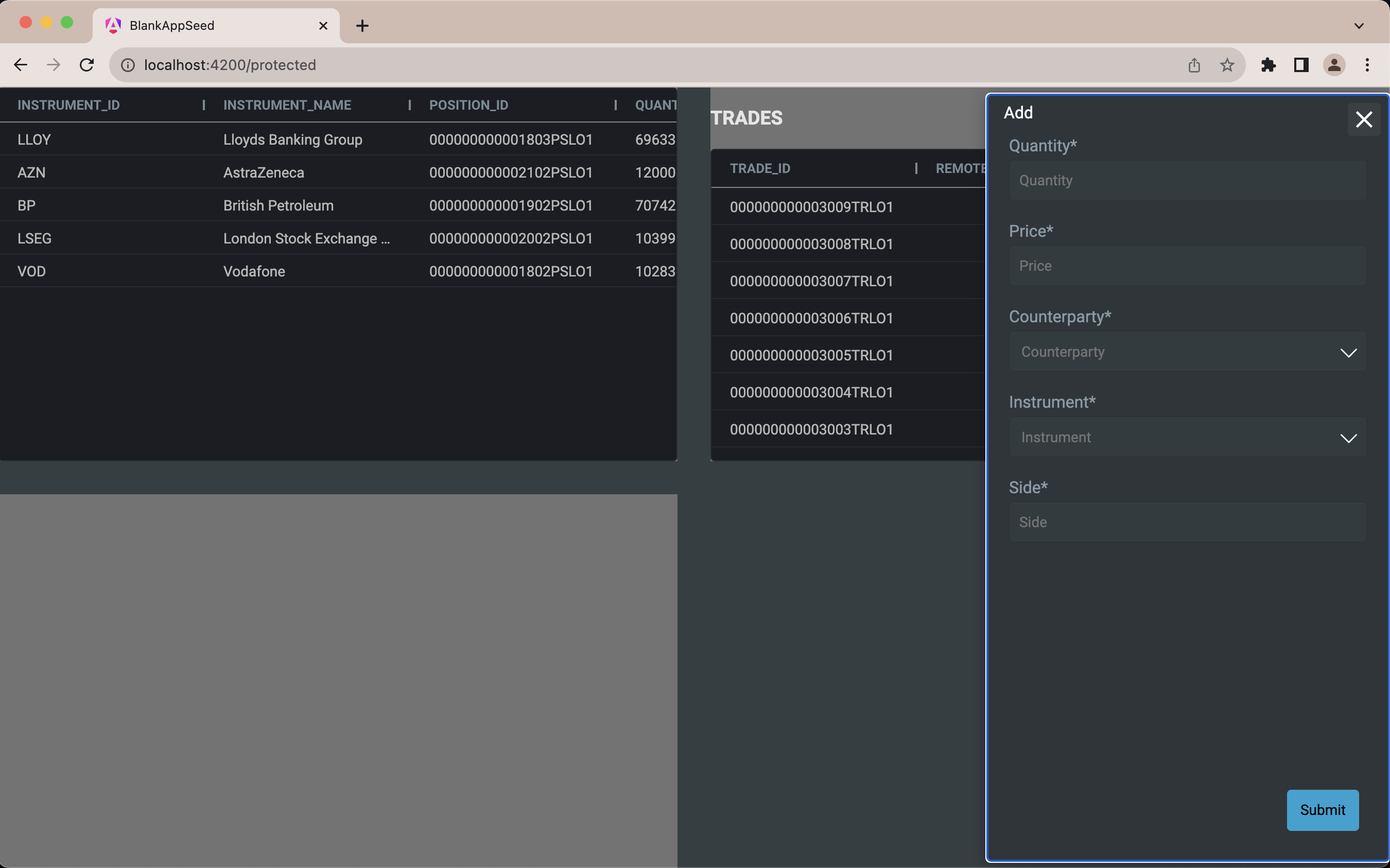
Once you have saved the file, you can see TRADES in the grid, and the Add and Edit buttons enable you to perform CRUD operations on the data displayed.
Note that when you click on the Add button, this displays a limited number of fields - these are the fields that were defined in the schema.
Compare this to the form you see when click on the Edit button. This has more fields; it has been autogenerated from the metadata, and you would probably not want all these fields in practice.
Step 6. Add a donut chart with configuration
- Add the chart and its datasource to the template:
<!-- Donut Chart -->
  <zero-g2plot-chart type="donut" [config]="donutChartConfig">
    <chart-datasource
      resourceName="ALL_CHART_DATA"
      server-fields="SIDE INSTRUMENT_SIDE_ALLOCATION"
      charts-fields="groupBy value"
      isSnapshot="false"
      [criteria]="allocationCriteria"
    ></chart-datasource>
  </zero-g2plot-chart>
- Add configuration for the chart:
// In your home.component.ts file
protected donutChartConfig: any = {
  angleField: 'value',
  colorField: 'groupBy',
  label: {
    type: 'spider',
    labelHeight: 28,
    content: '{name}\n{percentage}',
    style: {
      fill: 'white',
    },
  },
  interactions: [{ type: 'element-selected' }, { type: 'element-active' }],
};

protected allocationCriteria: string = ''; // Empty string initially
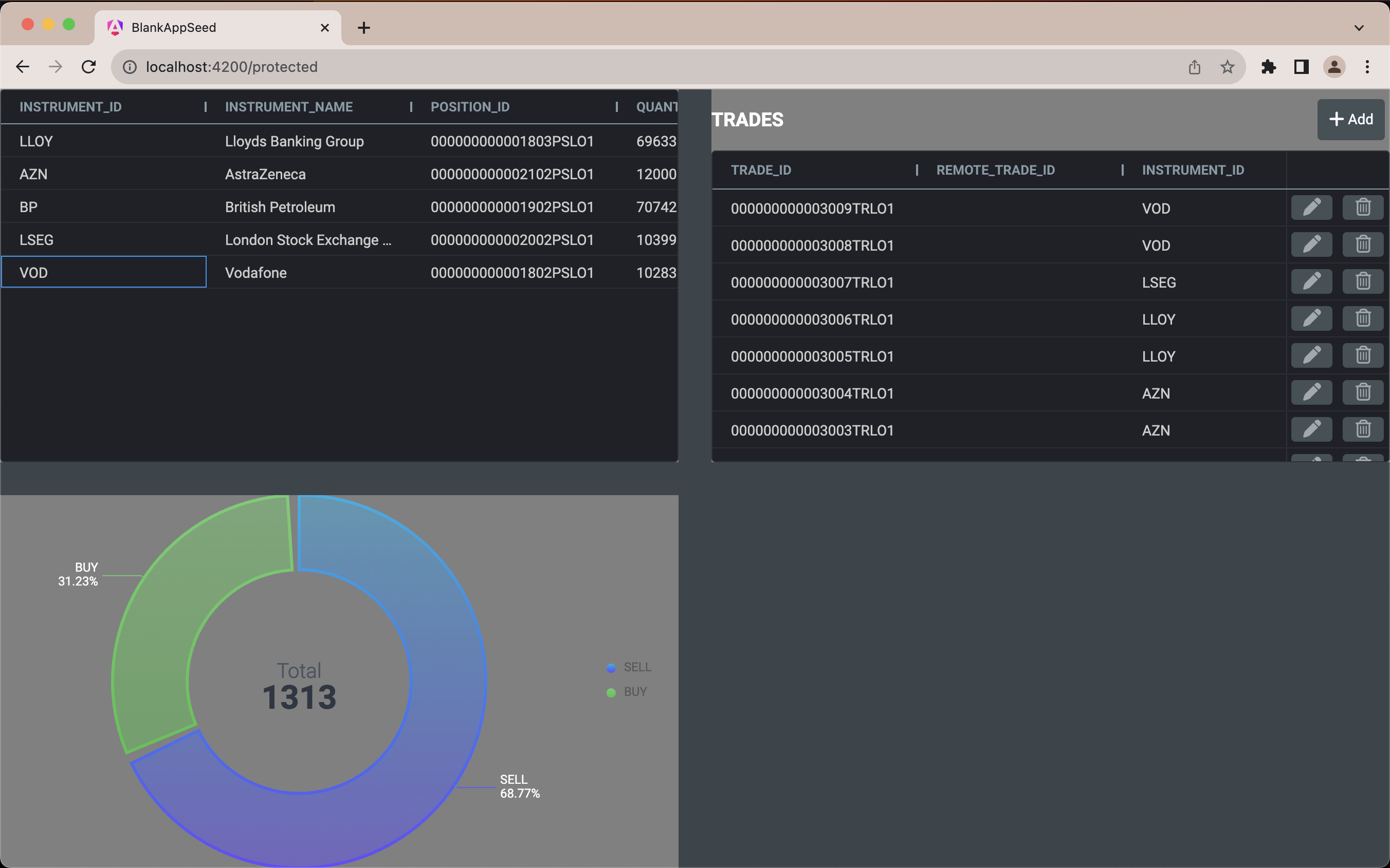
The chart is displayed in the bottom left corner:
7. Handle when the user selects a row
You want to be able to click on a row in the grid to view the relevant data.
- Add an event handler in HTML
In your component HTML template, add an event handler for selecting a row based on a user click:
 <zero-grid-pro
    (rowClicked)="onRowClicked($event)"
 >
    <grid-pro-genesis-datasource
        resource-name="ALL_POSITIONS"
    ></grid-pro-genesis-datasource>
 </zero-grid-pro>
- Implement a function to handle the selection
Implement the onRowClicked function in your home.component.ts file:
// In your home.component.ts file
onRowClicked(e: Event) {
    this.allocationCriteria = `((INSTRUMENT_ID == '${(e as CustomEvent).detail.data.INSTRUMENT_ID}'))`;
}
Now you can click to select your position, and the chart will change to display data for that position.