Header
Introduction
The Header micro front-end provides a navigation bar and flyout menu, with routing and account-logout capabilities.
You can customise:
- the icon shown on the navigation bar and flyout menu (this shows the Genesis logo by default)
- navigation links at the left-hand side of the navigation bar
- the control buttons on the right-hand side of the navigation bar; these can be shown or hidden, and their behaviour controlled via event listeners
- the contents of the flyout menu
Here is an example of the navigation bar with three navigation items, and all three control buttons shown.

This next example is the same as the previous example, except the Genesis logo is replaced with a custom icon.

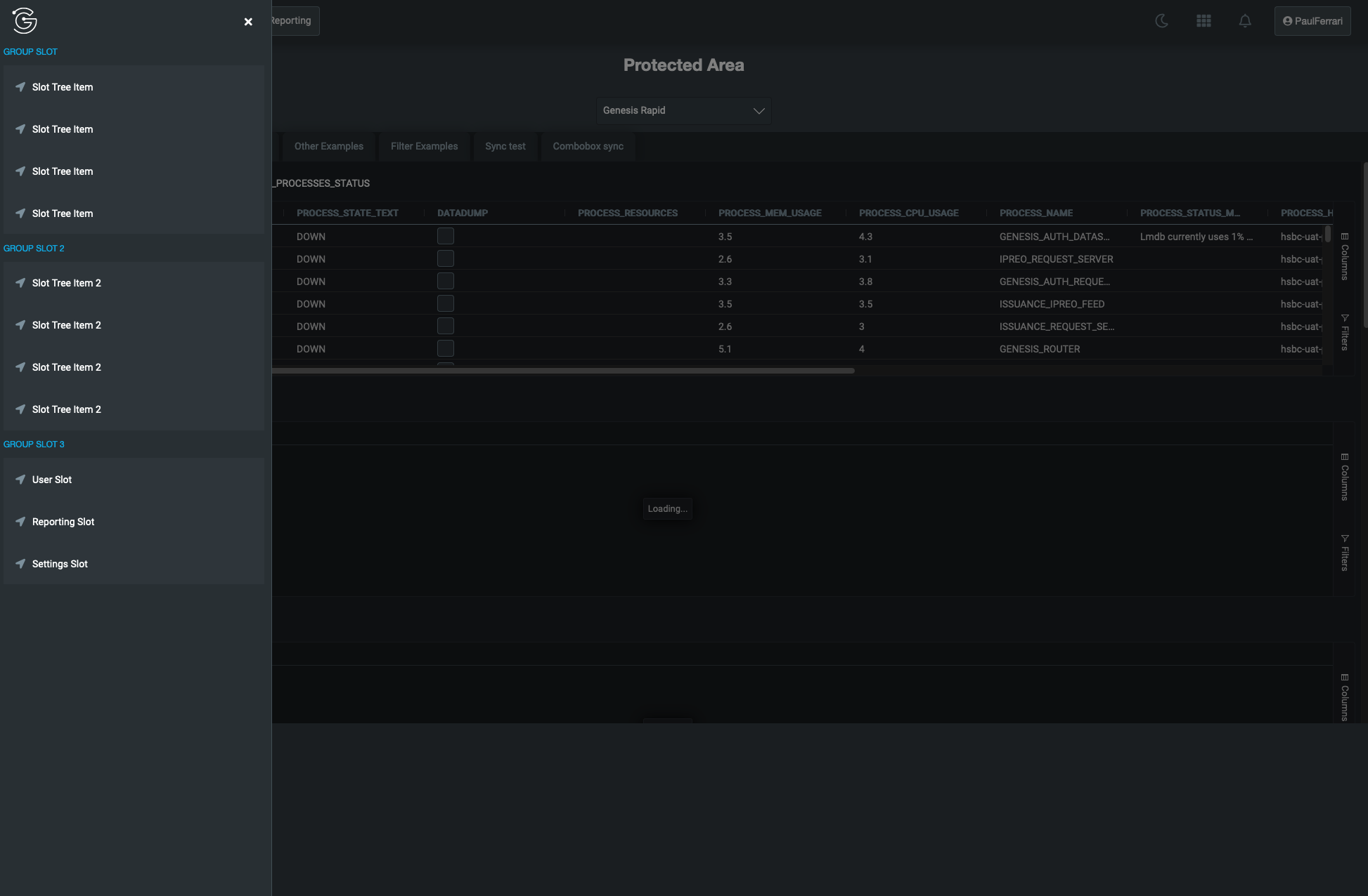
In this next example, we have put a set of example options set in the flyout menu.
Header set-up
Seed apps
A lot of the Genesis seed apps come with the Header set up by default. To verify, you can do a text search in the client code for the <foundation-header> tag.
In this case, you only need to do the customisations described in customising the header.
The allRoutes array, which you need to change to set the navigation buttons on the Header, is found in client/web/src/routes/config.ts.
Manual set-up
To enable this micro front-end in your application, follow the steps below.
- Add
@genesislcap/foundation-headeras a dependency in your package.json file. Whenever you change the dependencies of your project, ensure you run the bootstrap command again. There is more information in the package.json basics page.
{
  ...
  "dependencies": {
    "@genesislcap/foundation-header": "latest"
  },
  ...
}
This page assumes you're already using the Login and Routing systems that are part of foundation-ui for the logout and routing functionality.
It is possible for you to set up routing manually, but that won't be covered in this tutorial.
- In the top-level class of your application, import the Navigation class and inject it as a dependency.
import { Navigation } from '@genesislcap/foundation-header';

@customElement({ name, template, styles })
export class MainApplication extends GenesisElement {
  @inject(MainRouterConfig) config!: MainRouterConfig;
  @inject(Navigation) navigation!: Navigation;

	...

}
If you haven't used the inject annotation in your application yet, you'll need to get it from the @genesislcap/web-core package.
- Set a reference to the
navigationobject on the Genesis router when you instantiate it; this enables you to set up navigation functionality from the navigation bar in the navigation items step.
// genesis-router will likely have other attributes such as :config too
const MainTemplate: ViewTemplate<MainApplication> = html`
  <genesis-router :navigation=${(x) => x.navigation}></genesis-router>
`;
- Add the
foundation-headertag as part of the html that you set as the markup for thedefaultLayoutin your router configuration.
export const defaultLayout = new GenesisElementLayout(html`
<div class="container">
	<!-- show-luminance-toggle-button boolean attribute added to show that button on the navigation bar -->
	<foundation-header show-luminance-toggle-button></foundation-header>
	<!-- Other markup -->
</div>`);

export class MainRouterConfig extends RouterConfiguration<LoginSettings> {

	...

	public configure() {
		this.title = 'Example app';
		this.defaultLayout = defaultLayout;
		...
	}
}
Customising the header
Icon
By default, the navigation bar and flyout menu show the Genesis logo. You can override this by setting the logoSrc attribute. For example:
<foundation-header logo-src="https://icotar.com/avatar/genesis"></foundation-header>
The logoSrc defines the image that you want to display. Adding this attribute updates the logo on both the flyout and navigation bar. If you want to keep the Genesis logo, just omit this attribute.
Navigation items
You can add navigation items to the left-hand side of the navigation bar. For each element, you can set slot="routes" attribute, so that navigation is controlled via a @click event. The following is a really basic example for adding a 'Home' button:
html`
<foundation-header
	<zero-button
		slot="routes"
		value="1"
		@click=${(x, c) => c.parent.navigation.navigateTo("home")}
	>Home</zero-button>
></foundation-header>`;
The navigation object referenced via the parent object is why the navigation object is added as an attribute to the fast-router in the setup step. From it, the navigateTo method can be called, which allows the user to navigate around the finished application from the navigation buttons.
Moving on from this basic example, a dynamic set of routes can be configured, using the repeat directive.
- Add the routes configuration into an array in the router configuration class.
export class MainRouterConfig extends RouterConfiguration<LoginSettings> {

	// New configuration added to existing MainRouterConfig class
	public allRoutes = [
		{ index: 1, path: 'protected', title: 'Home', icon: 'home', variant: 'solid' },
		{ index: 2, path: 'admin', title: 'Admin', icon: 'cog', variant: 'solid' },
		{ index: 3, path: 'reporting', title: 'Reporting', variant: 'solid' },
	];

	...
}
- When setting the navigation items, use the
repeatdirective to iterate over the defined routes and create a navigation item for each one.
The following example creates a button with an associated logo for each of the three defined routes:
html`
<foundation-header
    <div slot="routes">
        ${repeat(
            (x) => x.config.allRoutes,
            html`
                <zero-button
                    appearance="neutral-grey"
                    value="${(x) => x.index}"
                    @click=${(x, c) => c.parent.navigation.navigateTo(x.path)}
                >
                    <zero-icon variant="${(x) => x.variant}" name="${(x) => x.icon}"></zero-icon>
                    ${(x) => x.title}
                </zero-button>
            `
        )}
	</div>
></foundation-header>`;
Control buttons
There are three control buttons that can be shown or hidden on the right-hand side of the navigation bar (these are hidden by default). Each one of them is a boolean attribute that can be added where the <foundation-header> tag is defined.
| Logo | Toggle Attribute | Dispatched Event |
|---|---|---|
| Moon | show-luminance-toggle-button | luminance-icon-clicked |
| Misc | show-misc-toggle-button | misc-icon-clicked |
| Notifications | show-notification-button | notification-icon-clicked |
Implementing the functionality of the buttons is up to the client. For example:
- Define the functionality of the event callback in the class of a class which is a parent to the router.
export class MainApplication extends GenesisElement {

	onMiscButtonPressed() {
		// ... do something
	}
	...
}
- Set the event listener in the parent html to call the defined functionality.
// genesis-router will likely have other attributes such as :config too
const MainTemplate: ViewTemplate<MainApplication> = html`
  <genesis-router
		:navigation=${(x) => x.navigation}
		@misc-icon-clicked=${(x) => x.onMiscButtonPressed()}
	>
	</genesis-router>
`;
Menu contents
To set the content of the flyout menu, add the content in the html within an element that has the slot="menu-contents" attribute.
<foundation-header>
	<div slot="menu-contents">
		<!-- Example markup -->
		<p>GROUP SLOT</p>
		<zero-tree-view>
			<zero-tree-item>
				<zero-icon name="location-arrow"></zero-icon>
				Slot Tree Item
			</zero-tree-item>
			<zero-tree-item>
				<zero-icon name="location-arrow"></zero-icon>
				Slot Tree Item
			</zero-tree-item>
		</zero-tree-view>
		<p>GROUP SLOT 2</p>
		<zero-tree-view>
			<zero-tree-item>
				<zero-icon name="location-arrow"></zero-icon>
				Slot Tree Item 2
			</zero-tree-item>
			<zero-tree-item>
				<zero-icon name="location-arrow"></zero-icon>
				Slot Tree Item 2
			</zero-tree-item>
		</zero-tree-view>
	</div>
</foundation-header>
License
Note: this project provides front-end dependencies and uses licensed components listed in the next section; thus, licenses for those components are required during development. Contact Genesis Global for more details.
Licensed components
Genesis low-code platform