Web Components - File Upload
The file-upload component can be used to select single or multiple files from the local file system. Selected files can be uploaded to a server using the Upload button.
The Upload button is disabled if no file is selected.
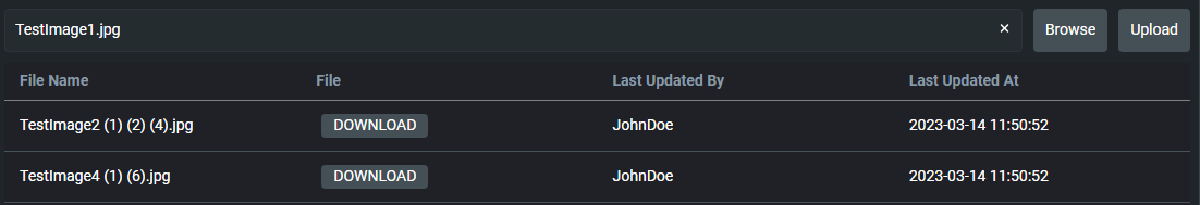
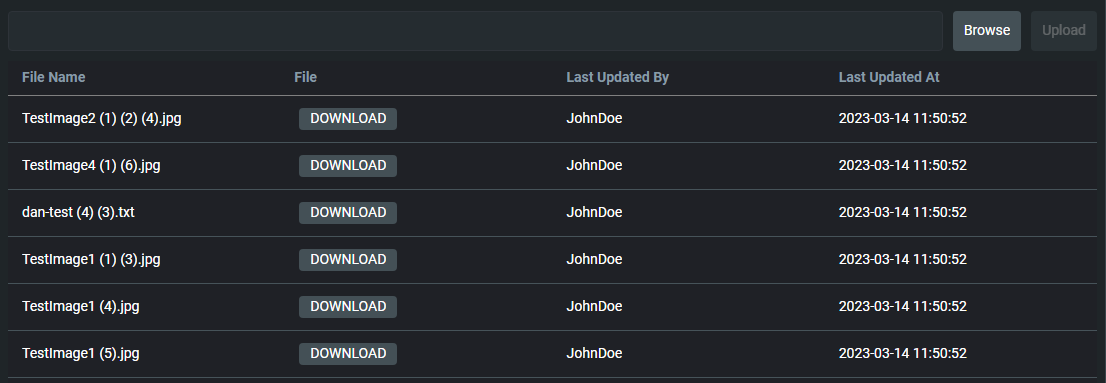
In addition, the uploaded files can be viewed in the data-grid. The data-grid also provides a Download button.
Set-up
In order to use the file-upload component, you need to import it from a design system. In the example below, we import it from the zero-design-system and register it.
import { provideDesignSystem, zeroFileUpload } from '@genesislcap/zero-design-system';

provideDesignSystem().register(zeroFileUpload());
Usage
The file-upload component can be used as shown below:
    <zero-file-upload
          entity-id="Demo"
          field-name="ENTITY_ID"
          upload-key="series">
    </zero-file-upload>
Please note that the entity-id, upload-key and field-name attributes are required for the file-upload component to work. Additionally, if no other attributes are passed, the file-upload component will use the default values for those attributes.
If you want to customise the file-upload component, you can pass the attributes as shown below:
    <zero-file-upload
          label="Upload Files"
          accept="image/*,.doc,.docx,application/pdf"
          file-size-limit-bytes="104857600"
          uploaded-files-resource-name="ALL_FILE_ATTACHMENTS"
          entity-id="Demo"
          field-name="ENTITY_ID"
          upload-key="series"
          grid-fields="FILE_NAME DOWNLOAD LAST_UPDATED_BY LAST_UPDATED_AT"
          :downloadEventName=${(x, c) => x.handleDownload.bind(c.event)}>
    </zero-file-upload>
For more detailed information, see the Attributes and Props section below.
Attributes and Props
The following attributes can be used to customise the file-upload component:
Attributes marked with an (optional) tag are not required for the file-upload component to work. If no value is passed for those attributes, the file-upload component will use the default values.
| Attribute Name | Description |
|---|---|
label (optional) | This attribute specifies the caption for the file input, similar to HTML Label element. There is no default value specified for label. |
accept (optional) | This attribute determines the file formats that the file input should be able to select. Multiple file formats can be specified by separating them with a comma: accept=".doc,.docx,application/pdf". By default all file formats are allowed. |
fileSizeLimitBytes (optional) | This attribute specifies the maximum file size in bytes that is supported by the file input. The default value is 104_857_600 (100MiB). |
uploadedFilesResourceName (optional) | The uploadedFilesResourceName attribute is the target Data Server or Request Server name that the data-grid uses to display the uploaded files. The default value for this attribute is ALL_FILE_ATTACHMENTS. |
uploadEventName (optional) | This attribute specifies the HTTP endpoint that will be used to upload the files. The default value is attachment-handler/upload. |
fieldName | This attribute specifies the field name that will be used by the uploadedFilesResourceName as key for filtering the files list. |
entityId | This attribute specifies the unique identifier that will be used by the uploadEventName endpoint to upload the files. This unique identifier will also be used by uploadedFilesResourceName as a value to filter the files list. |
uploadKey | This attribute specifies a unique key that will be used by the uploadEventName endpoint to upload the files. |
grid-fields (optional) | This attribute specifies the name of fields that you want to display as grid columns from the metadata of the data-grid datasource. By default all the fields from data-grid datasource metadata will be displayed. They must be specified in the format: FILE_NAME DOWNLOAD LAST_UPDATED_BY LAST_UPDATED_AT. The ordering which the fields are specified, will be reflected in the data-grid columns. If you want to display the Download button in the grid, you must include the DOWNLOAD field in the grid-fields attribute list along with downloadEventName attribute. |
errorOut (optional) | This attribute specifies the event that is triggered when an error occurs during the upload process. |
downloadEventName (optional) | This attribute is an observable of type function. When you click the download button from a row in data-grid, it sends the rowData object as a parameter to the downloadEventName function. It should return the name of the endpoint that will be used to download the file. This is required in order to enable the download functionality. |
Use cases
The file-upload component can be used for the following use cases:
- uploading and downloading files
- displaying uploaded files in a grid